Blog
Obscure Holiday Calendar for July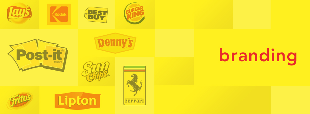
You Say Good Buy And I Say Yellow: A Bright Insight in Yellow’s Place in Branding
As with most companies, there is a method (along with plenty of research) to their madness in selecting just the right color to reflect their image and brand.
Because colors can be closely tied to a person’s emotions, behavior and experiences, the application of color psychology is both a complicated process—and not a particularly exact science.
But exact or not, it remains crucial in the decisions made by architects, chefs, packaging designers, company owners and even expectant parents.
In the past, we’ve discussed the prominence of yellow and red in the fast food industry—due to research finding that while red triggers stimulation and hunger, yellow triggers feelings of happiness and friendliness. Hardee’s, Wendy’s, Popeye’s, McDonald’s, Burger King and In-N-Out Burger are all successful examples of those findings.
Regarding outdoor advertising, success is measured in readability and its ability to grab the viewers’ attention—especially from great distances. So, when exhaustive research revealed the top ten most effective color combinations, it was no surprise that #3 was yellow lettering on a black background, and #1 was black lettering on a yellow background.
In addition to happy and hungry, yellow also stands for freshness, positivity, energy, optimism, enlightenment, intellect, loyalty and joy. Which made it an ideal hue to reflect the personal positioning and long-term branding for companies such as:
Ikea
Best Buy
Shell
Lay’s
Lipton
Kodak
Post-It
Snapchat and
Ferrari
EPILOGUE: “50% of successful advertising is having a great idea. The other 50% is convincing the client it’s a great idea, too.”
In 1979, long before the days of hyper-stimulated drinks such as Red Bull and Rock Star filled the thoughts (and veins) of millennials, the Coca-Cola Company had created a highly-caffeinated, yellow-tinted citrus drink to compete with Pepsi’s Mountain Dew.
The task of naming the new drink fell to the Atlanta Ad Agency of Freeman+Leonard.
After creating a list of hundreds of possible names, the creative team agreed that Mello Yello was their favorite, and even had a giant neon sign created for their presentation to executives of Coca-Cola.
During the meeting when the sign was revealed, the room went deadly silent, until one executive said “Mello Yello is catchy, but we think it has drug connotations (a reference to the 1966 song “Mellow Yellow” by Donovan which many interpreted as a hippie’s anthem to being laid-back, chilled out and way stoned).
Without missing a beat, one of the creatives leaned across the table and said, “Gentlemen, have you ever heard of the word Coke?!”
After a brief pause, there was an eruption of laughter.
And the rest, as they say, is soft drink history.