News
Marketer Magazine: On The Record: Conducting Strong Interviews with the Media
The Box Scores: How Quadrilaterals Helped Shape Branding
When it comes to establishing, promoting, packaging and strengthening corporate identity, companies have long known that what’s in a shape can be as important as what’s in a name. Which is why the efficiency and effectiveness of quadrilaterals have such a prominent place in marketing and advertising.
As mentioned before, the seven quads are equated with being strong, brave, safe, reliable and professional. And regardless of what you’re selling, companies want to be perceived as one — if not all — of those things.
While circular or abstract shapes are prominent in nature, quads are not. But with their rigid angles and defined boundaries, they have proven to be ideal in reflecting a business’s brand.
OK, we’ll grant you that the trapezoid, rhombus and kite aren’t exactly setting the corporate logo world on fire. They’re weird, and frankly, unshapely. One fun exception is the DHL logo; with its tilted rhombus shape it evokes an image of speed and movement, two aspects they certainly want consumers to associate with the company.
But squares and rectangles are clean and efficient. And whether applied as a logo or app, it gives companies (and their designers) a literal blank canvas in which to create and house original and recognizable works of art.
It’s hip (and profitable) to be square.
Our brains are hardwired to assign meaning to shapes. This association is often on a subconscious level, making it a powerful branding tool. One of the most ubiquitous shapes used in brand logos is the square. The four equal sides evoke feelings of trust and represent equality, stability, balance and safety. It’s basically a warm, fuzzy feeling in a box, and nearly 22% of company logos have capitalized on the square’s good vibes.
Consumers want a square deal and companies like Lego, Gap, Microsoft and Domino’s Pizza understand this.
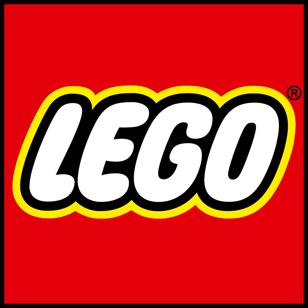
LEGO
Lego’s square logo is a perfect choice because it embodies positive vibes while representing the company’s product – blocks. The bright red square represents safety and stability. And its bright, bubbly colors and font make it appealing to children and parents alike.
Lego’s iconic icon has been nearly unchanged for more than 40 years. The only update was a small tweak, or in Lego’s own words, a “graphic tightening,” that adjusted the colors so they would translate better digitally.
GAP
For 30 years, Gap had a blue square logo encasing the brand’s name. In 2016, without conducting any market research and seemingly without a second thought, Gap decided to roll out a new logo. While the same elements remained – a blue square and the brand’s name – the new logo positioned “Gap” outside of the square. This outside-the-box decision proved to be extremely unpopular, and thanks to social media, customers en masse aired their grievances about the new logo. It lasted one whole week before being dishonorably discharged and replaced with the old logo.
Gap learned the hard way that while all squares have equal sides, not all squares are created equal. The brand’s next logo dropped the square completely and the positive psychological associations that go with it. Among Gap’s devoted customers, the best thing they had to say about it was that they didn’t hate it.
![]()
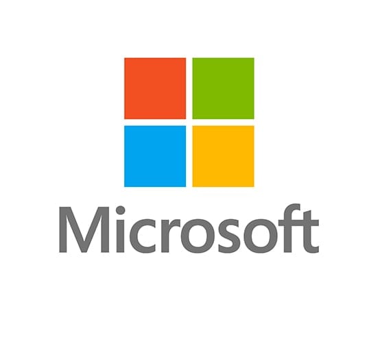
MICROSOFT
Microsoft’s logo is considered one of the squarest of them all. It’s composed of four colored squares put together to create one larger square, and the different colors represent the company’s color-coded suite of apps: red for Powerpoint, green for Excel, blue for Word and yellow for Outlook. The logo is also associated with Microsoft’s operating system Windows, so the squares also serve as symbolic windows.
Although considered boring by some, the logo has represented the company well and established Microsoft's products as reliable, professional and distinguished. Take that, Gap.
 DOMINO’S PIZZA
The logo for this successful pizza chain is a domino made from two tilted squares, one red with one white dot and one blue with two white dots. Some will disagree, but pizza isn’t that serious, so the whimsical tilt to the squares is a nice touch. While the logo has gone through a few updates over the years, it’s been essentially the same since 1965.
The three white dots represent the original three Domino’s locations. It’s clear that the brothers who founded the iconic pizza place had no idea how successful they would become, because their original plan was to add a new dot for every new location. If they’d stuck to that, their logo would now have more than 14,000 dots on it. Thankfully, they didn’t go that route, allowing the Domino’s logo to remain a classic.
![]()
MEL Magazine found someone on the Domino’s subreddit (yes, that’s a real thing) with a lot of time on their hands who gifted the world with a mock-up of what a logo with 14,000 dots would look like:
![]()
Square logos are classic, but that comes with the downside of being somewhat commonplace. The ubiquity of square logos can mean that people aren’t intrigued when they see it, or may not notice it at all. The brands we mentioned prove that while the square may not be exciting, the subconscious associations we have with this simple shape are positive and can inspire brand loyalty.