News
Marketer Magazine: On The Record: Conducting Strong Interviews with the Media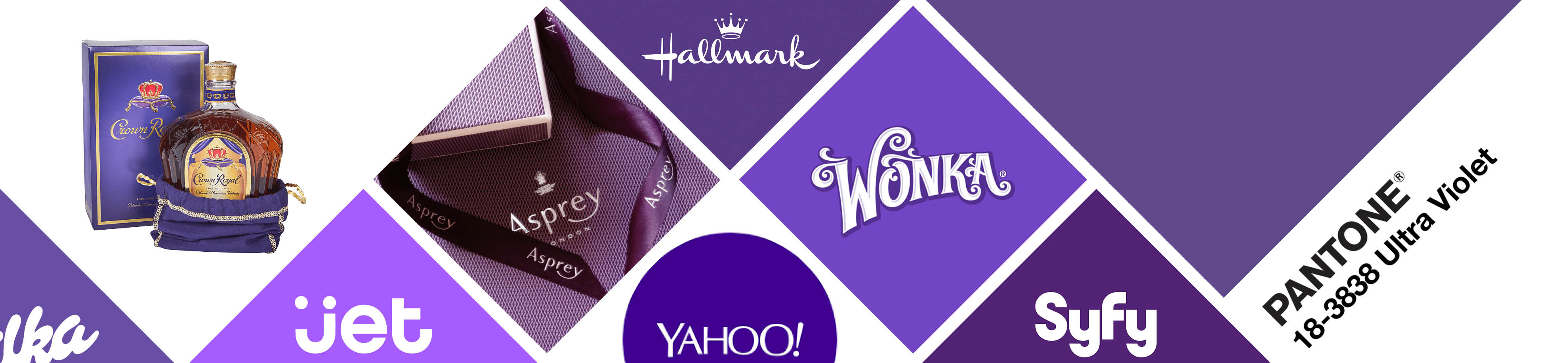
Violets Beget Violets: How Some Brands Love Violet with A Purple Passion
As the unofficial color of meditation, violet is associated with peace and harmony, and is seen as the connective color between the physical and spiritual worlds (which raises the question why was thePsychologically speaking, violet brings plenty of groove to the table. If put to a vote, daydreamers and visionaries alike would elect it in a landslide. As the unofficial color of meditation, violet is associated with peace and harmony, and is seen as the connective color between the physical and spiritual worlds (which raises the question why was the goo covering Carol Anne and her mother in Poltergeist red and not violet?).
Goo aside, violet promotes positive images of the future, imagination and enlightenment, unconditional love and the freest forms of artist expression, all while associating itself with luxury, power and wealth-based exorbitance.
In the world of brand marketing, violet is used sparingly. In fact, less than 5% of major corporations use it in their logo. Violet and its many variations don’t pop, conjure a distinct mental association or grab the attention that others do (think red traffic light, yellow school bus or orange prison uniform).
Despite these drawbacks, violet has proven to be a clear winner for some companies, though the backstory of its use isn’t always as clear. A few interesting and outstanding examples include:
![]()
- Asprey: Embracing violet’s longstanding association with nobility and luxury, this London-based company has offered the world the very finest in jewelry, silver and leather goods for more than 237 years. They even offer a line of high-end personal care products called Purple Water.
![]()
- Hallmark: The premier purveyors of good tidings, Hallmark is the largest and oldest greeting card company in the US. And considering their logo’s primary color represents creativity, artistic expression and undying love, it’s no wonder violet remains a hallmark for Hallmark.
![]()
- Wonka: Owned by Nestlé and inspired by author Roald Dahl, this confectionery company brilliantly launched their brand to coincide with the release of the film adaptation of Dahl’s novel Charlie and the Chocolate Factory. As far as choosing the vibrant violet color for their logo? In Willy’s own words, it was pure imagination.
![]()
- Syfy: The go-to cable channel for the supernatural, paranormal and all things out of this world, their use of violet to illustrate images of the future—as well as our connection between earth and the great beyond—seems both a super and natural choice.
![]()
- Crown Royal: With violet in alliance with nobility, including it in their logo is apropos and downright redundant. And has been since 1939, when this Canadian whisky maker introduced it in tribute to King George VI’s visit to their native country.
![]()
- Yahoo: While their web services may not match up exactly with violet’s psychological characteristics, the story behind the “Yahoo Plum” more than make up for it. It seems that when the company founders painted their new office walls with gray, it dried lavender. They loved it, saw it as a sign and for the last 24 years have joined the elite few of successful violet-based brands.
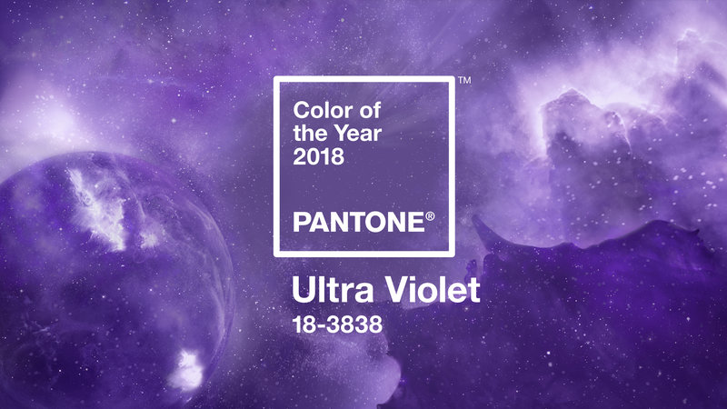
- And finally, as fate would have it, Pantone: Known for the Pantone Matching System (PMS), their comprehensive color schemes are the flip-book bible to industries of all kinds. As an extremely shrewd marketing promotion, Pantone carefully-selects and magnanimously releases a “color of the year” each December. With each new color, they expound the endless possibilities it brings to fashion, decorating and design. The 2018 winner? You guessed it…Ultra Violet. Said a Pantone spokesman, “it’s a dramatically provocative and thoughtful purple shade that communicates originality, ingenuity and visionary thinking that points us towards the future.” We say, ditto.