Back to Portfolio
Baton Rouge City-Parish Human Resources Department
Project

Baton Rouge City-Parish Human Resources Department

Services
Copywriting
Identity
Strategy
Video

Objective: Put the human back in human resources.

When the Baton Rouge City-Parish Government’s HR department reached out to us for a refresh, we thought … our favorite things! Design and people!

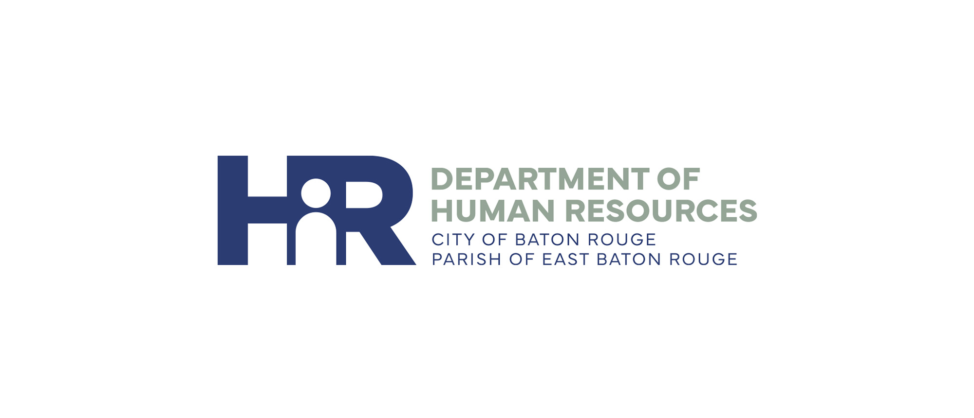
The HR department logo has a stylistic emphasis on the human being. The likeness of a person is surrounded by the bold, strong letters H and R, communicating protectiveness and support. The mark also reminds viewers that HR departments are composed of people, too – community members facing the same challenges, successes and milestones as the employees they serve.

project image

The straightforward, dominating font relays to the viewer a sense of stability and longevity that is at the core of what the city-parish government provides in terms of employment.

The color palette was chosen to complement the city-parish colors while they are also strong enough to stand alone. The blue family evokes feelings of peace and a darker navy blue lends itself to feelings of authority and strength. The combination of stability and authority are fitting for a department with the primary goal of supporting people.

project image

Their new logo made its debut in a local television commercial, and in a six-month-long digital ad and social media campaign.